In my 4.5-star review of the new iPad Air this week, I devoted a whole section to praising the device’s elegant design. “Why change the design,” I asked, “when it looks as good as this?” I stand by that sentiment, but there is a limit.
The Air’s current design debuted precisely one iteration ago, with the launch of the fourth-generation model in 2020. Arguably this was itself a copy of the square-edged all-screen design that came to the iPad Pro line in 2018, but I’ll cut Apple some slack to allow for the gradual diffusion of design developments from premium to mid-range products.
In any case, there are far worse examples of design stagnation to worry about. Most obviously the “new” iPhone SE takes a state-of-the-art processor and 5G antenna and wraps them in a design that debuted with the iPhone 6 in 2014. Macworld has been reviewing curved iPhones with 4.7-inch screens and Home buttons for seven and a half years. My son is younger than the iPhone SE design and he’s old enough to beat me at chess. It’s getting ridiculous.
The rest of the iPhone range isn’t as bad as that, but the 13-series handsets aren’t exactly a hotbed of aesthetic innovation either. They’re the same design as the iPhone 12, which were themselves a fairly conservative update of a design we first saw with the iPhone X in 2017. And the rumors of the iPhone 14 suggest more of the same. Apple’s favored tactic with the recent iPhones and iPads is to stick with a design as long as it can, then change it just enough–square off the corners, that ought to do the trick–to earn itself a few more years.
 https://b2c-contenthub.com/wp-content/uploads/2022/01/different_think.jpg?resize=300%2C168&quality=50&strip=all 300w, https://b2c-contenthub.com/wp-content/uploads/2022/01/different_think.jpg?resize=768%2C432&quality=50&strip=all 768w, https://b2c-contenthub.com/wp-content/uploads/2022/01/different_think.jpg?resize=1200%2C675&quality=50&strip=all 1200w, https://b2c-contenthub.com/wp-content/uploads/2022/01/different_think.jpg?resize=1536%2C864&quality=50&strip=all 1536w, https://b2c-contenthub.com/wp-content/uploads/2022/01/different_think.jpg?resize=1240%2C697&quality=50&strip=all 1240w, https://b2c-contenthub.com/wp-content/uploads/2022/01/different_think.jpg?resize=150%2C84&quality=50&strip=all 150w" width="1200" height="675" sizes="(max-width: 1200px) 100vw, 1200px" />
IDG
When we look across the Apple range, where do we find exciting, risky design? Not from the makers of the Apple Watch, who have barely moved away from the original design. Nor from the Mac, which has lately been turning out attractive but characterless devices. Take the Mac Studio, which somehow recycles ideas from the 20-year-old G4 Cube while still just being a stretched Mac mini. And the one time Apple’s Mac designers went out on a limb was with the MacBook Pro when it plagiarized the most unpopular feature from the iPhone.
Even the colors we’ve been seeing from Apple lately are safe. I like the iPad Air’s new purple, but it’s the most sensible purple in the world. The company came up with vibrant new colors for the 24-inch iMac last year and then hid them around the back. What happened to the Blue Dalmation, Flower Power, and translucent cases? Where is the wild innovation that gave us the iMac G4? It’s like Apple doesn’t want to be noticed anymore.
Big enough to fail
This may be par for the course when you’re as big and successful and visible as Apple. Apple doesn’t need to take risks to sell lots of iPhones and will attract furious criticism if it gets it wrong. How many articles have you read decrying the Magic Mouse and the first-gen Apple Pencil and all the other Apple design disasters? How many tweets did you read making jokes about the AirPods Max Smart Case looking like a handbag?
I was one of the reviewers who was critical of the AirPods Max, but I’m worried that lately, Apple doesn’t even seem to be interested in taking that kind of risk. I want polarizing products, at least some of the time. I want Apple to release weird-looking devices like the trashcan Mac Pro because a company that’s willing to fail is more likely to succeed in an interesting way. With risk comes reward.
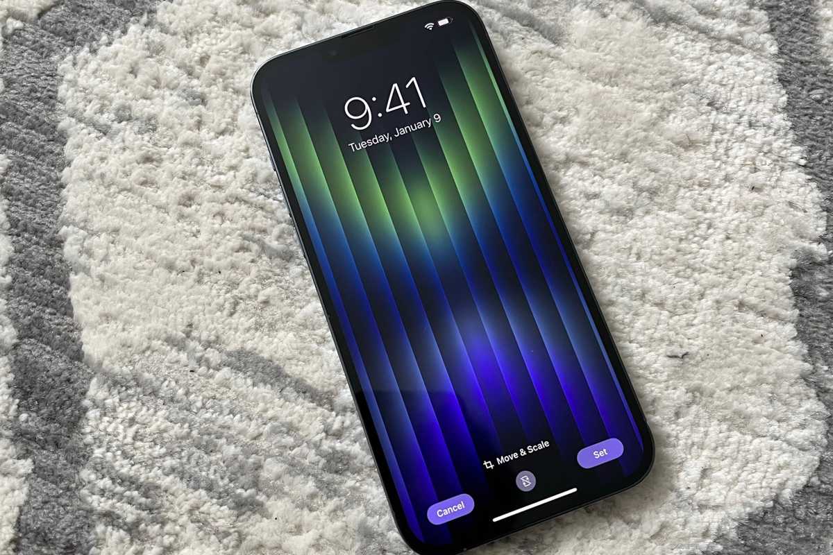 https://b2c-contenthub.com/wp-content/uploads/2022/03/iPhone-SE-wallpaper.jpg?resize=300%2C200&quality=50&strip=all 300w, https://b2c-contenthub.com/wp-content/uploads/2022/03/iPhone-SE-wallpaper.jpg?resize=768%2C512&quality=50&strip=all 768w, https://b2c-contenthub.com/wp-content/uploads/2022/03/iPhone-SE-wallpaper.jpg?resize=1200%2C800&quality=50&strip=all 1200w, https://b2c-contenthub.com/wp-content/uploads/2022/03/iPhone-SE-wallpaper.jpg?resize=1536%2C1024&quality=50&strip=all 1536w, https://b2c-contenthub.com/wp-content/uploads/2022/03/iPhone-SE-wallpaper.jpg?resize=2048%2C1365&quality=50&strip=all 2048w, https://b2c-contenthub.com/wp-content/uploads/2022/03/iPhone-SE-wallpaper.jpg?resize=1240%2C826&quality=50&strip=all 1240w, https://b2c-contenthub.com/wp-content/uploads/2022/03/iPhone-SE-wallpaper.jpg?resize=150%2C100&quality=50&strip=all 150w" width="1200" height="800" sizes="(max-width: 1200px) 100vw, 1200px" />
The iPhone SE’s best design element is the wallpaper.
IDG
Companies playing catch-up need to get noticed, to rock the boat a bit, so they are incentivized to try things out. Apple used to be one of those companies. As it’s become the largest company in the world, however, its motivation seems to not fix things that aren’t broken.
But this is a shame, especially for a company with such a strong visual identity. One of the best things about being a huge company is having the ability to take risks and absorb the hit if they don’t work out. If Apple Arcade or Fitness+ doesn’t turn a profit, Apple can just shut it down and go about its business having at least given it a try. So why can’t that principle apply to product design like it once did?


